New Year's Resolutions. You pretty much know how that goes. Everyone claims something they'd like to improve on the next year and by mid-January you forget about it. Rather than something productive like staying fit or eating well, I chose to improve my graphic design skills. I don't consider myself artistic, so this was a challenge to disprove a preconceived notion I had about myself. With that goal in mind, I came up with a project to complete: Use Canva to make a design for all of my favorite Pokémon.
Originally, I gave myself a grace period to complete these 55 by the end of the year. But then, quarantine hit. While quarantine prevented me from traveling to Salt Lake City for VGC Regionals, it did give me plenty of time to work on this project. And lo and behold, I completed it within three months and had time to make a bonus design! Making these designs was a process of learning and growing with a skill, overcoming obstacles to reinvigorate creativity, and celebrating something I loved in a way I didn't think was possible before. Without further ado, check them out:
Slurpuff
 |
| My first design! I browsed through some Canva templates, found this one, and changed the colors and shape placement a bit. |
Alakazam
 |
| Rather than base this on Alakazam's color scheme, I chose purple to evoke a psychic feel. The eyes, spoons, sparkles, and dots are also arranged in a clock-like fashion. |
Roserade
 |
| Roserade's original design was very convoluted with random flowers everywhere. After getting feedback from a friend, I found a way to incorporate the rose and masquerade theme. The end result was much cleaner! |
Primarina
 |
| There isn't much to Primarina's design -- bubbles and the pink/blue color scheme matched her, so I went with it. |
Sabeleye
 |
| The background kind of reminds me of 101 Dalmatians or the part in Be Our Guest where the utensils are dancing on different lines. Definitely a whimsical background for sure! |
Serperior
 |
| I really enjoyed how the plants and flowers act like a picture frame for Serperior. |
Copperajah
 |
| This one also had plenty of background noise initially, but I cut that out after getting feedback from a friend. The word below Copperajah is Tamil for steel. |
Dragapult
 |
| This is one I revisited throughout the project. Tempted to go back and make the triangles a solid fill. |
Rotom
 |
| Kind of wanted to make a pseudo Where's Waldo look with this one. Applying the individual lightning bolts to each ghost took work! After this, I took a break from this project until quarantine. |
Tyranitar
 |
| The first design I completed during quarantine. This is where I challenged myself to not overthink things and just go with what I felt worked. Paid off for sure -- the clean yet jagged design really shows off Tyranitar's power. |
Ursaring
 |
| While very simple, this grew to be one of my favorite designs. The idea was just to continue the circle pattern on Ursaring's belly. Almost looks like a tshirt design! |
Crabominable
 |
| I wanted to convey both the tropical setting of Alola and the cold areas Crabominable inhabits. The cooler background, white palm trees, and white waves were meant to bring that to life. |
Jellicent
 |
| This took a very long time to complete. The idea was to have Jellicent seem very below the surface, which was a challenge at first. The waves up top were the trickiest part since it was harder to mask colors in Canva. |
Corsola
 |
| This was when I first fell in love with gradients. The theme behind Corsola's design was having her reflect on her past self. |
Azumarill
 |
| I found a bubble illustration on Canva, threw on a pink background, and bam! I especially like how the bubbles almost look like the evolution animation in Generation III. |
Drifblim
 |
| Originally I wanted to add more to Drifblim's design, but kept it simple to make a more clean look. It almost has a Seussical feel to it! |
Orbeetle
 |
| Originally, the words "hypnosis" and "space" came to mind when thinking about Orbeetle, so I tried to incorporate both in this design. |
Heliolisk
 |
| Heliolisk are found in arid climates, so brought a little desert flair to this design. |
Venusaur
 |
| Still not 100% sure if the dots coming out of Venusaur's flower was the best move, but the intent was to show Venusaur charging up a Solar Beam. |
Excadrill
 |
| I wanted to mimic the scars on Excadrill's body with this design. While they're not the exact shape, I like how it's almost as if it's tearing through the canvas. |
Rillaboom
 |
| Creating Rillaboom's drum was MURDER! I'd rather not talk about the 2+ hours sunk into it. At the very least, the end design turned out well, and I like the music theme accompanied by the earth brown tones. |
Electivire
 |
| Originally I had giant lightning bolts in the back, but keeping it simple won out again. The stripes also has a baseball uniform feel to them! |
Espeon
 |
| I like gradients and I like sparkles. That's pretty much how this design came to be. |
Snorlax
 |
| Thought it'd be whimsical to make a sort of patterned background for Snorlax! Making the background was actually pretty simple -- a manner of copying + pasting the previous row of fruit and shifting them slightly. |
Vespiquen
 |
| At this point, I felt confident creating my own backgrounds -- the honeycomb design was fun to make! If you've ever played Capcom vs. SNK 2, it has sort of that vibe to it too. Even threw in some red hexagons for an additional pop of color. |
Latios
 |
| The song Soaring Illusions came to mind when working on this, so I attempted to incorporate what it'd be like to soar with Latios over Hoenn through the night sky. |
Ho-Oh
 |
| I originally thought Ho-Oh would have had one of the more grand designs. However, the simplicity really brings out Ho-Oh's elegance. A nice bonus is that the gradient used also fits Heartgold's box art! |
Hitmontop
 |
| Originally, I had no idea which Pokémon would receive this design! Replicating the animation of Superpower and Close Combat, Hitmontop seemed to be the perfect choice to smack in the middle of this. |
Nidoqueen
 |
| Fitting enough, the base design was from a Canva theme called "Girl Power". The paint-like scratches almost has an earth-tone to it, and the color scheme is a nice contrast since it's Nidoking's. |
Galvantula
 |
| Galvantula is an electric spider, so I wanted to showcase that without just throwing lightning bolts everywhere. Plus, the dark blue/purple tones give off a Static Shock feel to them! |
Volcarona
 |
| I was unsure at first what to do with Volcarona. Originally wanted to incorporate the sun but in a more powerful way than using an illustration, so I came up with this. Also has a binary sunset feel to it if you're a fan of Star Wars. |
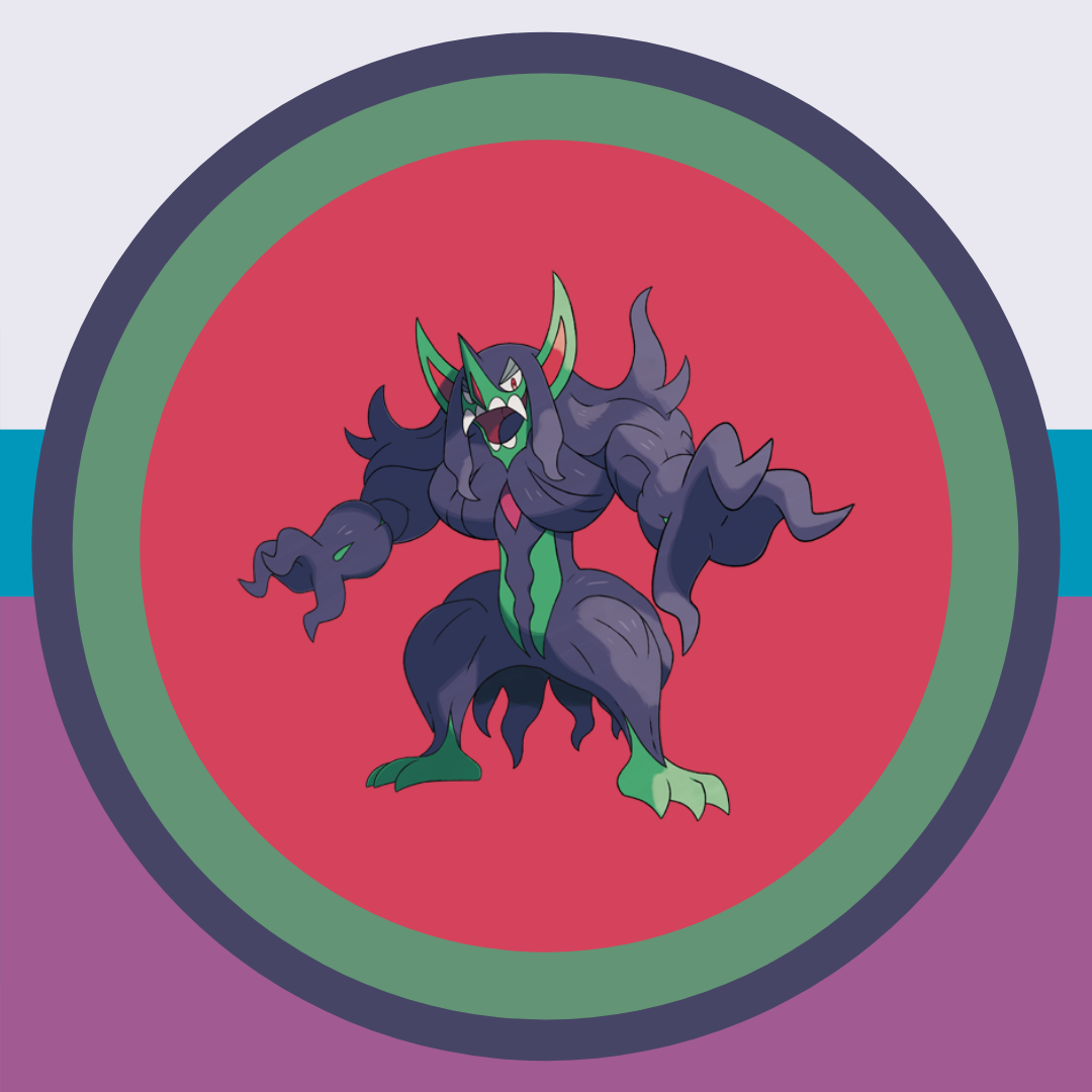
Grimmsnarl
 |
| There were so many directions I could have taken with Grimmsnarl -- I honestly blanked and just replicated his colors. The outer colors are also Grimmsnarl's shiny colors, which are the inverse of his normal form. |
Scizor
 |
| After working with Scizor, I got my second wind with coming up with designs. Scizor was the first Pokemon I put on a platform, and I especially liked how the circles on Scizor's mandibles were changed into spotlights. Reminded me a bit of the Pokémon World Tournament in Black and White 2. |
Greninja
 |
| Originally, I wanted Greninja to have appeared to have just landed on the scene to fight bad guys like a ninja would. When coming up who the opponents would be, Charizard and Lucario came to mind and then I thought "wait aren't all three in Smash?!" So yeah, this then became a nod to Smash Bros. |
Darmanitan
 |
| Darmanitan's design was based off the Old Relic and the episode of the anime where Ash encounters one in a bell tower. Not my favorite design, but I appreciate I tried something new with this one. |
Pidgeot
 |
| The idea of "sky" and "speed" came to mind when thinking of Pidgeot, so I used the colors of its headfeathers for the diagonal lines and the blue from Mega Pidgeot as the background. |
Clefable
 |
| For Clefable, I was inspired by both Mt. Moon and the McDowell Mountains, the mountain range I drive towards on the way back home from work. |
Butterfree
 |
| Butterfree's design was inspired by the episode "Bye Bye Butterfree" and the purple sparkles by the powder moves Butterfree tends to know. |
Raticate
 |
| Raticate's design was pretty tricky cause I initially tried to make this a grassy green look. Ultimately, the more autumn design fit well, and it reminded me a bit of Ecruteak City in Johto. |
Gastrodon
 |
| I personally am not a fan of my design for Gastrodon. Tried to convey a swamp-like environment, but I hit a wall in creativity. Still, I appreciated the attempt behind this. |
Eelektross
 |
| I was slowly recovering from my creative block at this point. Definitely room for improvement, but it wasn't a total mess like Gastrodon's. The gradient circles were meant to highlight Eelektross's inner claw. |
Houndoom
 |
| I originally didn't intend Houndoom's to be creepy, but here we are. It almost has a Halloween feel to it. I also matched Houndoom's face with the line in the middle to make it a bit more intimidating. |
Shiftry
 |
| The phrase "Voice of the Wicked Forest" came to mind when making Shiftry's design, so I used dark greens and blacks for a menacing look. Shifty's leaf hands also have the power to create hurricanes, so it was fun incorporating a sort of wind theme to this as well. |
Staraptor
 |
| With Pidgeot being speed, Staraptor was more about power. The triangle end point mimics Staraptor's headfeathers and has a sort of power theme to it. Originally, this whole design was inverse! I turned it upside down and voila. |
Mudsdale
 |
| At the time, I was watching the Sun and Moon series on Netflix and rewatching some of my old battles from VGC 2017. With that, both the move High Horsepower and Tectonic Rage came to mind, so I wanted to incorporate that in Mudsdale's design. Funny enough, the horseshoes are just U's I put dots on! |
Bronzong
 |
| Bronzong was pretty tricky at first, but I went for a representation of both the moves Trick Room and Gravity. Originally I had red sparkles on this design as well, but that was a bit overkill. |
Heracross
 |
| I honestly had no idea what to do with Heracross at first! Followed the KISS acronym (keep it simple, stupid) and ended up with something pretty decent. Also like how there's a "cross" theme going on! |
Celebi
 |
| I was inspired to make Celebi's design right after watching an episode of Sun and Moon where Celebi transports Ash and Torracat to the past. The circle is like a "time portal" of sorts, and the forest has become quite different in the future. Really enjoy how this design almost tells a story! |
Luxray
 |
| Luxray was originally inspired by this card from Next Destinies. He almost has a Batman look to him guarding over the city at night! And the windows even light up to form an X. Took a bit to get what I wanted with this design, but I liked the end result. |
Lanturn
 |
| There was a design with waves and I though "that's pretty cute!" So I was moving Lanturn around the frame and forgot to put her in front of one set of waves and this happened. It was kind of a cool 3D effect to have her pop from the waves, so I kept it. Classic example of a happy little accident. |
Empoleon
 |
| Empoleon was inspired by the card art for Dark Explorers, which proved tricky at first. I tried to make some sort of "steel" design, but that got away from his penguin look. I then tried to bring in a royal look, but that got a bit messy. But then it hit me -- why not combine the royal theme and penguin aspect? So there it is: iceberg crown in the back! I then shifted the darker steel tones to the bottom to make the design cleaner. |
Aurorus
 |
| It took me a bit to finally finish Aurorus. Initially, I wanted to bring about an aurora borealis-inspired design, but that became Clefable's as I continued work on it. I then was inspired by her sails to make a gradient, and the diamonds as the background was a nice touch. |
Decidueye
 |
| Taking a bit of inspiration from Houndoom and Shiftry, I made a line in the middle with the orange section. The trees on the top and bottom also look like arrows. |
Tangrowth
 |
| Originally, I tried to make Tangrowth's design based on this -- the ball of energy from Call of Legends was a bit too much to replicate. I remember Tangrowth becoming one of my favorite Pokémon was because of a silly reason, so instead I went that route. It's almost as if Tangrowth is cutting through part of the pink line! |
Typhlosion
 |
| You know I had to save my favorite for last! The color scheme is based on Lance's battle background in Heartgold, and I made the Pokéball using three separate circles and a line. The golden-yellow line follows the contour of Typhlosion's face to make it stand out a bit. |
BONUS: Retro Typhlosion
 |
| With plenty of extra time, I made this quick homage to where it all started -- the Game Boy Pocket. Finishing this was a moment of triumph and a culmination of everything I learned throughout this process. |


